

Evaluation Question One - In what ways does your music video and digipak use, develop or challenge forms and conventions of real media texts?
Our music video uses, develops and challanges forms and conventions of real media products. However, our main focus and aim was to challange forms and conventions of real media products in order to make our final product a little different.
As a girl duet styling was very important as traditionally, girls are exploited to sell. A classic example of how women are exploited in music videos is Madonna's - Open Your Heart video as she performs in a very promiscuous way and is dressed provocatively for the male audience. However, we did not want to conform to the idea of exploiting.
This element is also important in order to present us to appeal to our target audience of teenage girls and young women. Before we decided on a particular style we conducted a lot of research into fashion followed by artists in our genre of music (electropop) and also did some broad research into the style we thought would work well and suit us best.
Below is a slideshow I created of the styles of clothing we looked and researched into. The slideshow includes photos of artists such as Dev and Kesha who are from the electropop genre. We also looked at many other artists styles such as Lady Gaga, Jessie J, La Roux etc.

 After doing some research into gender representation we decided to challange the representation of women in our music video by showing two strong female vocalists, without any male actors. We also wanted to make females appear powerful and more dominant than men. One way in which we made women look dominant than men is in the scene where I'm holding a photo of my 'boyfriend' and am scribbling over his face which he has no control over. Also we aren't dressed in ways that show off our bodies or make us look like sexual objects for the opposite gender to watch. Another way in which we appear more powerful than men is in the close up shot of Andrea's 'red' lips which could be seen as a tease. However, we have complete control over our bodies and no male figure around telling us what to do or appearing as the dominating one.
An example of another music video that has a dominating female artist in it is Cher Llyod's - Want U Back video. Although their are two male characters that take part in the video she is still represented as the dominant one as she is in control of herself and all the other characters.
A very clear example of how we did not want to represent ourselves is the way Natasha Bedingfield represents herself in her 'I Wanna Have Your Babies' music video and the previous example of how Madonna represents herself in her music videos through style of dress, performance etc.
Originally we planned to include a stop animation in our music video and so we did some reserach in to existing examples such as the one below which is from the indie alternative genre. We believe that this is another way we have challeneged existing forms and conventions of real media texts as we did not see stop animations used in any of the electropop genre music videos we watched. We wanted our music video to be quirky, fun, interesting and creative so we decided to stretch the genre a little by bringing a new element to it.
Below is a short video of our stop animtion:
Before creating my own digipak i did some research into existing digipaks in order to have an idea of the forms and conventions already used in the electropop and other genres.

I chose to analyse Michael Jackson's 'This Is It' digipak as Michael Jackson's music does not belong to a certain genre, but incorporates a wide variety of genres. Our music video and our overall style doesn't apply to one genre in particular either as we chose to stretch the electropop genre by incorporating various styles. This is why i thought it was a good idea to have a close look at MJ's style.
 As well as looking at a variety of different forms and convetions used in various genres I also did some research into digipak's from the electropop genre as it is the genre of our song. I decided to use and develop the forms and conventions used on digipaks in the electropop genre. For example, I used bold colours, quirky font and photos of us as the artists on the front cover.
Evaluation Question Two- How effective is the combination of your music video and your ancillary texts?
We wanted our music video to promote both our digipaks and magazine adverts making the audience want to buy and visit both ancilliary texts. For this reason we thought it would be important to present a consistent brand image across all products.

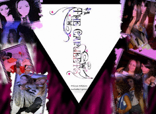
The photo on the left is our original band logo. As our style is girly and feminine we decided to go for a girly but still mature font. In order to make it more unique I decided to add some different elements such as the fairies, hearts and butterflies. I created our band logo using Photoshop as it allowed me to be more creative. However, after I completed making our first band logo I was then inspired with a different idea which was to maybe add some colour to the text instead of keeping it black and white as this will fit in better with our music video and our colouful, fun style.
 The logo on the left is now our final band logo and what it now looks like compared to our original. We both preffered this logo better than the first but just to make sure that we made the right decision we asked our families for their opinions and also got some audience feedback from students in school. Our feedback showed that we had made the right decision. We then repeated the logo on our digipak, in the opening credits of our video and on our magazine adverts.
We derived the name of the band from the old time favourite film Romeo & Juliet, The Capulets and The Montegues. We chose to be The Capulets as they were the good ones and also because the film is about love, relationships and working things out as is our chosen song. We thought this was a clever way of linking it to our song and also thought that it would work well. However, before we came to a final decision of choosing this name for our band we made a list of other possible band names and made sure we asked an audience in order to get some feedback and see what they thoought would work. We made a tally next to each name and counted up the results luckily most people also thought that the name we chose was clever and would work better than the rest.


This was my first digipak cover in progress. I made annotations on it to share what my ideas were at the time.

As you can see all I've put on my front cover is our band name/logo as this is what I would like everyone to recognise us by. Another reason to why I decided to keep my front cover logo based is because our logo is quite colourful and bold so i didn't want anything to take the attention away from that and didn't want it to look extremely busy. I also wrote 'Deluxe Edition' on the front to make it look and feel more professional and official.

I liked the idea of featuring us as the artists on the front and back cover of my digipak so that people can identify us in our music video and also remember us from our band name. I used Adobe Photoshop to create my digipaks as the programme allows me to be more creative and also allows me to create work of a higher and more professional looking standard. I started off on a blank white canvas then opened up our band logo as a seperate file and dragged it across. I then opened up all of the photos of Andrea and I which are from our times out together. I decided to use these photographs instead of our studio ones as I wanted it to have a more laid back and natural feel like our music video and also to help represent our personalities more. Another reason to why I chose to do this is because I thought that it would appeal to our target audience of young girls more. I then added more colour to my digipak cover by adding a pink spray effect on to a black background that I selected and painted in order to make it look more bold and so that it stands out. I also added a colour gradient effect to the photos and a quirky film camera boarder in order to make it look more creative and scrap book style. I also chose to add a triangular boarder shape in the middle to make it look abstract and to conform to the forms and convetions of the electropop genre as music videos in thie genre tend to have a lot of shapes, graphics and bold colours in them.
 I used similar tools and effects for my bacck cover and created a film strip effect on the back using our studio photos. I chose to put these on the back cover as I wanted people to get a more laid back feel of us on our front cover as it is the first side they will see and look at. I think that by adding the gradient effect on the studio photos we look less staged and serious. I used a very girly font on the back for our song names to keep up with our overal theme and style. I also added elements that make it personal to us and our audience such as our band signiture at the bottom 'Signed: The Capulets'. I also took a screenshot of part of our stop animation and used it as a logo for our productions company 'Ivory Key Entertainment' which links in with our quirky style and our music video. I also added fan pages such as a Facebook link, Myspace link and a fanpage website link for our audiences to follow us on.
 For the inside left of my digipak I decided to include a 'book of lyrics & photos' section which would be a little book that you'd pull out with the lyrics of the songs on our CD and some photos of the artists. I chose to do this to make it more personal and because I have come across lyric books in digipaks before which i quite like. I tried to keep my digipak consistent with it's black and pink themed background. I added the same airbrush effect to the background by creating a messy zig zaggy look. I then added the photo of me that was taken whilst I was setting up the studio for our photoshoot. I was actually holding the blank board when the photo was taken, I did not add that in myself. I added a semi circle to the top of the board to make it look like a slot and also added the text on the front using a feminine font.
 This is the CD design I created for my first digipak. I chose to keep this the same as I believe that it fits in with my final digipak just as well.
 On the left is my first draft and attempt at creating a magazine advert.
Image: I decided to have a photo of Andrea and I (The Capulets) on my magazine advert as I thought this is most appropriate for our style as we both perform in our music video and we are also on the cover of my digipak which is why I wanted to keep the continuous style. Also if we were to be a real band audiences would most probably recognise us by our image the most.
Font: Although I created a band logo for my group previously I didn't want to have it on my magazine advert as I thought it made it look a little over the top. Also I did some research into whether or not artists used a constant style for their name/band name and noticed at the end of my research that very few artists did so which is why I decided to change the style of our logo for my advert.
Colour: Andrea and I decided to do the opposite and go for a more colour in our music video, digipaks and magazine advert. Our colour scheme is in our band logo which consists of mainly, black, purple, pink and white. I stuck to this colour scheme when creating all of my ancilliary texts. However, I decided to carry a little bit of the original artists theme by keeping black and white in all my products and adding my own twist to them to make them personal to The Capulets and not Aly&Aj.
 On the left is my second magazine advert that I also created by using Photoshop in order to help develop my skills in using various different programs. I chose to create both my magazine adverts on Photoshop as it allowed me to use a variety of tools such as the 'lasso' tool which allows me to cut around the parts of a photo I like and take them out to create a new photo with a different background, positioning etc. Also the various tools allowed me to experiment and develop my skills more than programs such as 'paint' as this is a very basic editing program whereas Photoshop allows me to make my work look far more professional looking.
Image: The image I used on my magazine advert isn't really a photograph but a screen shot from my music video. The photo on my first magazine advert looks more staged and studio like so I wanted to go for a more fun, unplanned and natural image which will represent our group better. I chose to print screen and use this particular image because we are both smiling/laughing in the snow representing fun and our bubbly characters. I also like the way the snows in my hair and on my face as it shows that we may have been having a snow fight also a representation of having fun. I prefer this photo as I think it not only says a lot about us and our characters but it also looks more suitable and fits in with our idea of being quirky, fun, girly and also links in better with our music video.
 Here is my third and final magazine advert. I also created this using Photoshop, I chose to create another magazine advert that would fit better with my final digipak and also because I didn't use our original band logo on the other two. I thought it would be a good idea to create one with our original band logo on it as we've kept it consistent in all products. The photo on my magazine advert was taken by us whilst filming the studio scene for our music video. I decided to use this because it links in with our music video, we look happy, it looks fun and people would understand that the advert has something to do with music without reading the text.
 I used similar tools and effects for my bacck cover and created a film strip effect on the back using our studio photos. I chose to put these on the back cover as I wanted people to get a more laid back feel of us on our front cover as it is the first side they will see and look at. I think that by adding the gradient effect on the studio photos we look less staged and serious. I used a very girly font on the back for our song names to keep up with our overal theme and style. I also added elements that make it personal to us and our audience such as our band signiture at the bottom 'Signed: The Capulets'. I also took a screenshot of part of our stop animation and used it as a logo for our productions company 'Ivory Key Entertainment' which links in with our quirky style and our music video. I also added fan pages such as a Facebook link, Myspace link and a fanpage website link for our audiences to follow us on.

 On the left is my first draft and attempt at creating a magazine advert.
 Image: I decided to have a photo of Andrea and I (The Capulets) on my magazine advert as I thought this is most appropriate for our style as we both perform in our music video and we are also on the cover of my digipak which is why I wanted to keep the continuous style. Also if we were to be a real band audiences would most probably recognise us by our image the most.
Font: Although I created a band logo for my group previously I didn't want to have it on my magazine advert as I thought it made it look a little over the top. Also I did some research into whether or not artists used a constant style for their name/band name and noticed at the end of my research that very few artists did so which is why I decided to change the style of our logo for my advert.
However, I chose to write our band name in a girly font as our original is very feminine and this is what I thought looked best. The rest of the font is just normal, I chose to use a more simpler font for the rest of the text on my advert in order to make it all clear and easy to read as the font I used for my logo was barely readable as it all got squashed up when I tried to make the font smaller.
Colour: Andrea and I decided to do the opposite and go for a more colour in our music video, digipaks and magazine advert. Our colour scheme is in our band logo which consists of mainly, black, purple, pink and white. I stuck to this colour scheme when creating all of my ancilliary texts. However, I decided to carry a little bit of the original artists theme by keeping black and white in all my products and adding my own twist to them to make them personal to The Capulets and not Aly&Aj.
 On the left is my second magazine advert that I also created by using Photoshop in order to help develop my skills in using various different programs. I chose to create both my magazine adverts on Photoshop as it allowed me to use a variety of tools such as the 'lasso' tool which allows me to cut around the parts of a photo I like and take them out to create a new photo with a different background, positioning etc. Also the various tools allowed me to experiment and develop my skills more than programs such as 'paint' as this is a very basic editing program whereas Photoshop allows me to make my work look far more professional looking.
 Image: The image I used on my magazine advert isn't really a photograph but a screen shot from my music video. The photo on my first magazine advert looks more staged and studio like so I wanted to go for a more fun, unplanned and natural image which will represent our group better. I chose to print screen and use this particular image because we are both smiling/laughing in the snow representing fun and our bubbly characters. I also like the way the snows in my hair and on my face as it shows that we may have been having a snow fight also a representation of having fun. I prefer this photo as I think it not only says a lot about us and our characters but it also looks more suitable and fits in with our idea of being quirky, fun, girly and also links in better with our music video.
Font: Just like my first magazine advert I chose to go for a girly font for my band name as it is for a girl duet and the original band logo I made is very girly also. I wanted to tone it down a bit but still keep a similar font to my original logo. For the rest of the information I chose an edgy but clear font so it's easy to read. I've also wrote nearly everything in capitals mainly the information to show that it is important and to make it stand out more.
Colour: I used a lot of pink on this magazine advert as the colour pink is a very girly colour and stereotypically symbolises girls. Using this colour sends the audience a clear girly representation and fits in well with our overal style and theme. The pink also matches the colour of our lipstick and also the pinks that are used on my digipak covers. I believe that this magazine advert links in better with my latest digipak design.
I believe that my music video and anciliary texts make a good combination as I have tried to use elements that represent our music video on my products such as the photo on my second magazine advert which is a screen shot I took from our music video, the production company logo I chose to use is also a screen shot of our stop animation from our music video and also all of the colours used on my anciliary texts are in our music video too.
 Here is my third and final magazine advert. I also created this using Photoshop, I chose to create another magazine advert that would fit better with my final digipak and also because I didn't use our original band logo on the other two. I thought it would be a good idea to create one with our original band logo on it as we've kept it consistent in all products. The photo on my magazine advert was taken by us whilst filming the studio scene for our music video. I decided to use this because it links in with our music video, we look happy, it looks fun and people would understand that the advert has something to do with music without reading the text.
In addition to our regular group meetings we also stayed in touch through a number of different platforms in order to share ideas with eachother throughout the project. We used text messaging, WhatsApp, Facebook, Ipods, our blogs etc.
Before making our final product we created a practice music video to Lily Allen's video for Smile. This allowed us to experiment with the equipment and helped us learn more about camera angles and shots. Making this before hand also helped us practice and develop our skills using iMovie.

 Once we were happy with our song choice we watched countless amounts of music videos on YouTube and i watched some at home on music channels such as MTV to help inspire some creative ideas that we could incorporate in our own music video and play on some clever ideas. We watched music videos that were in the genre of the song we had chosen in order to have an idea of the specific codes and conventions that were being used and to have some of these convetions in our music video. However, we also watched music videos that belonged to different genre's as we wanted to stretch the genre we were working with and bring new ideas and techniques in order to make our video different to our songs original video and also to do something unexpected.
Originally Andrea and I planned on using rose petals in our music video to help represent different seasons of the year and also because we thought it would look really pretty. After we had planned our idea I found this video on YouTube which then inspired us to definitely try this idea out.

At the beginning of our project Andrea and I created a Prezi which we presented to the class. This helpes us plan out our ideas and research into our genre.

In the constructions stages of our music video we took out the Panasonic SD90 HD camera the school provided us with which helped us get clear, high definition footage allowing us to achieve work of a more professional quality. We also carried around the HD Flip camera with us to film outtakes, any opportunities to film and just incase the battery on the Panasonic camera ran out as it did at Southend for example whilst we were filming the last few seconds of our music video. luckily, we had the Flip camera with us. I also brought my digital SLR Nikon D7000 camera out with me as it allowed me to take high definition photographs and also allowed me to film in high definition with its clear camera. We filmed half of our music video on my slr camera and i also took photographs whilst out on location filming and preparing props for our music video.
Here is a short video Andrea and I made after editing the studio scene of our music video. This is just a short explanation of what we did using imovie that day.
Evaluation Question Four - What have you learnt from your audience feedback?
In the constructions stages of our music video we took out the Panasonic SD90 HD camera the school provided us with which helped us get clear, high definition footage allowing us to achieve work of a more professional quality. We also carried around the HD Flip camera with us to film outtakes, any opportunities to film and just incase the battery on the Panasonic camera ran out as it did at Southend for example whilst we were filming the last few seconds of our music video. luckily, we had the Flip camera with us. I also brought my digital SLR Nikon D7000 camera out with me as it allowed me to take high definition photographs and also allowed me to film in high definition with its clear camera. We filmed half of our music video on my slr camera and i also took photographs whilst out on location filming and preparing props for our music video.
Evaluation Question Four - What have you learnt from your audience feedback?

Our target audience was predominantly teenage girls to young adults around the ages of 14 to early 20s who would associate with our band as well as finding them aspirational. We employed a multiplatform strategy in order to promote our video and gain feedback from our traget audience and a wider range of fans and friends. Facebook posts, shares and likes, YouTube views and data and questionnaired that I created by using surveymonkey.com.
Below is the link to my survey:

Pros -
- Consistent colour scheme
- Lots of images of artists - clear brand
- Theme of romance - cupid, hearts
- Artists not on the front cover
 Pros -
 - Unqiue
- Like polaroid theme
- Artists featured on front and back
- More playful images and natural than 1
- Person for fans
Here are my list of song ideas for my didgipak, Andrea also came up with some ideas. We both wanted to use the same song titles in order to make our digipaks look more professional. We had a discussion about both our ideas and then also decided to collect some audience feedback which we did by walking around school reading our song title choices out to people and creating a tally next to each one.
Live Laugh Love
Dear karma
Keep on wondering
Like the rest
Those were yesterdays feelings
Todays your day
What we love
Just wanna have fun
Only a matter of time
We're young, wild & free
I'm done, have fun
Dream big
Nothing to lose
Come alive in the night time
Born to love
Below are the ones we came to the decision of using after collecting some audience feedback from students in our media class and around the school, the evidence from our tally chart showed that the following titles were the best out of the ones we had come up with:
The Potential Breakup Song
Smile For Me
Stay Away Cupid
Those WereYesterday's Feelings
Dear Karma
We're Young Wild & Free
You're the Sun on a Cloudy Day
Live Laugh Love
Green Eye Envy
Watched Me Walk Away
Cross Your Heart
Born to Love

Pros -
- More modern
- Bright & eye catching
- Central framing of artists - portrait makes it more like a magazine advert
- Bold text
- Colour scheme - black, pink & white

- Endearing image
- Informal
- Natural image
- Black & pink colour scheme
- Girly - makes girl band image more clear
- Consistent colours - text, border and photo


